The Challenge:
ACES had done their website themselves, and it served their purposes for a while. Like many growing businesses, their initial website was a starting point. As you grow and your business matures, you too need to keep your website up-to-date. In ACES' case, they were ready for a more professional, modern look. We set out to make the site crisp, clean and easy to navigate, without a lot of fluff.
The Solution:
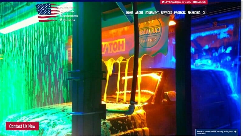
We designed the home page with moving images in the hero area, using the "Ken Burns" effect:
- Made the entire home page a "summary" of the site, telling the overall ACES story
- Implemented detailed pages that further explain what's on the home page
- Enhanced the images to make them "pop" more
- Created an email opt-in to gather email address and deliver a nice freebie
- Ensured someone visiting can easily contact them by email or phone, with two buttons that are sticky to the top of the page.
The Result
Note: Done in conjunction with Wordflirt.


